In the intricate dance of commerce, where first impressions linger, and choices are made in the blink of an eye, the psychology of colour emerges as a silent maestro orchestrating consumer perceptions.
Nowhere is this more apparent than in custom labels and packaging.
Beyond aesthetics, the colours chosen for your labels profoundly shape your brand’s narrative and influence your customers’ emotions.
Let’s embark on a colourful journey, unravelling the psychology behind the hues that grace your custom labels and packaging.
1. Red: The Bold Symphony of Passion and Power
The allure of red extends far beyond its visual impact; it’s an emotional catalyst. In custom labels, red signifies passion, power, and urgency. It’s the colour of love, excitement, and unbridled energy.
Real-Life Radiance: Iconic Coca-Cola Red
Consider the iconic red of Coca-Cola. The choice of this vibrant hue is no accident. It’s a deliberate invitation to experience the enthusiasm and joy associated with the brand. The red custom labels don’t just mark a beverage; they symbolize a moment of shared happiness.
2. Blue: The Calming Cadence of Trust and Serenity
Blue, with its tranquil resonance, is the colour of trust, dependability, and calm. In custom labels, blue can instil a sense of reliability and serenity. It’s a hue that communicates professionalism and integrity.
Real-Life Radiance: The Oceanic Allure of Tiffany & Co.
Picture the iconic Tiffany Blue. This soft, enchanting shade has become synonymous with luxury and sophistication. The custom labels of Tiffany & Co. jewellery boxes don’t just wrap precious items; they envelop them in an aura of elegance and trust.
3. Green: The Verdant Palette of Freshness and Growth
Green, the colour of nature, invokes freshness, growth, and vitality. In custom labels, it’s a hue that aligns with eco-friendliness, health, and harmony. It’s a visual promise of a natural connection, such as when packaging premium tea.
Real-Life Radiance: The Wholesome Greens of Whole Foods
Whole Foods, a purveyor of organic and natural products, uses green custom labels to communicate its commitment to health and sustainability. The labels aren’t just wrappers but statements of a wholesome ethos.
4. Yellow: The Luminous Glow of Optimism and Joy
Yellow, the colour of sunshine, radiates optimism, warmth, and joy. In custom labels, it’s a hue that captures attention and communicates a positive, uplifting vibe. It’s a visual invitation to embrace brightness.
Real-Life Radiance: The Cheerful Yellow of Lipton Tea
With its sunny yellow packaging, Lipton Tea invites consumers to a world of warmth and rejuvenation. The custom labels don’t just adorn tea boxes; they infuse a sense of joy into the tea-drinking experience.
5. Purple: The Regal Hue of Luxury and Creativity
Historically associated with royalty, luxury, and creativity, Purple adds a touch of opulence to custom labels. It’s a colour that conveys sophistication and a dash of artistic flair.
Real-Life Radiance: The Purple Majesty of Cadbury
Think of Cadbury’s signature purple. The custom printing on their chocolate bars isn’t just wrappers; they’re invitations to savour moments of indulgence and luxury. The regal hue enhances the perception of the chocolate within.
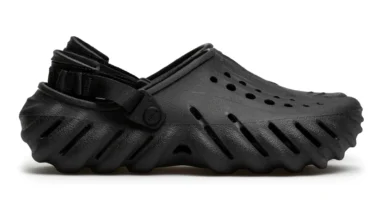
6. Black: The Timeless Elegance of Simplicity and Power
Black, the epitome of elegance and simplicity, holds a unique allure. In custom labels, it’s a colour that signifies sophistication, power, and a timeless sense of style.
Real-Life Radiance: The Understated Elegance of Chanel
Chanel, a symbol of timeless chic, often employs black custom labels. The simplicity of the colour enhances the brand’s image of enduring elegance and allure.
7. Orange: The Vibrant Burst of Energy and Playfulness
Orange, the colour of energy and playfulness, injects vibrancy into custom labels. It’s a hue that evokes a sense of enthusiasm, creativity, and a dynamic spirit.
Real-Life Radiance: The Zesty Orange of Fanta
Fanta’s orange custom labels mirror the effervescent and playful nature of the beverage. The colour isn’t just on the packaging; it represents the lively experience.
Painting Success with Every Label
As you navigate the creative realm of custom labels and packaging, remember that your chosen colours are more than just a visual aesthetic.
They are potent communicators, speaking to the hearts and minds of your consumers. When done correctly and using the expertise of print professionals, you can wield this and see lasting results.
Whether you’re aiming for the bold passion of red, the calming trust of blue, or the playful energy of orange, each colour on your custom labels is a brushstroke in the masterpiece of your brand’s story.
So, embrace the palette, infuse your labels with intention, and let the psychology of colour be the secret ingredient that elevates your products from ordinary to extraordinary.